
The cringe sponsor moment in a live show is universally recognised — and universally counterproductive. Audiences resent obvious integration. Brands look smaller when their logo gets bigger. Below is how we approach it instead.
The Hierarchy of Integration
From most effective to least: motif (a colour, shape, or sound that recurs without naming the brand), narrative (a story beat that pays off the brand without referencing it directly), prop (a branded object used by a character), wardrobe (a costume element that nods to the brand), explicit reference (the brand named in dialogue). Most productions over-use the bottom of this hierarchy.
The Pre-Brief That Matters
Brands that brief the creative team early on brand truth — what the brand actually believes, not what it sells — get better integration. Brands that brief on “make our logo bigger” get worse integration.
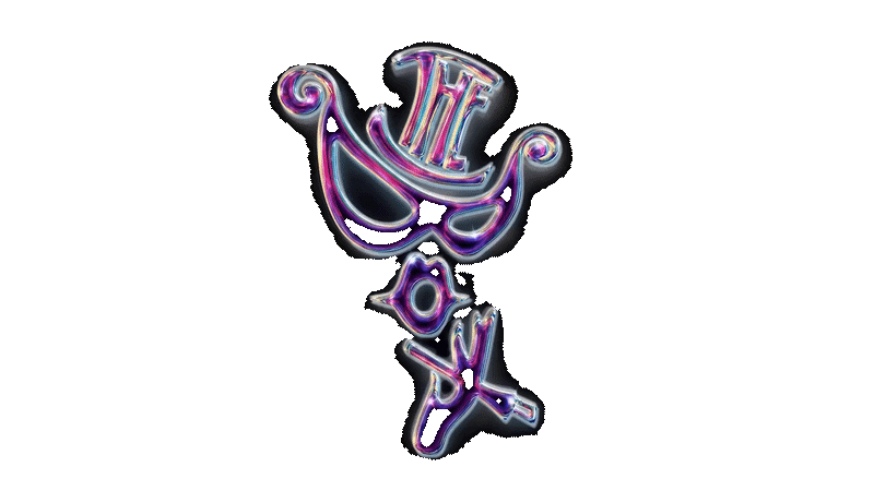
The Single Reveal Principle
If the brand must be explicitly revealed, do it once. The curtain-call moment, where the show’s motif resolves into the brand name, is far more memorable than five logo-projections during the show.
The Audience-Test
We test integration with a small audience preview. If 70%+ of the audience can name the brand after one viewing — and didn’t feel “advertised at” — the integration worked.
The Receipts
Brand-integrated shows that follow this approach see post-event brand search lifts of 18–34% versus traditional sponsorships in the same audience profile.
The Lesson
The audience pays attention to brands that pay attention to them. Subtle integration is the highest form of brand respect.

